Disaster Reporting
Cochran_infographic1Read About My Process
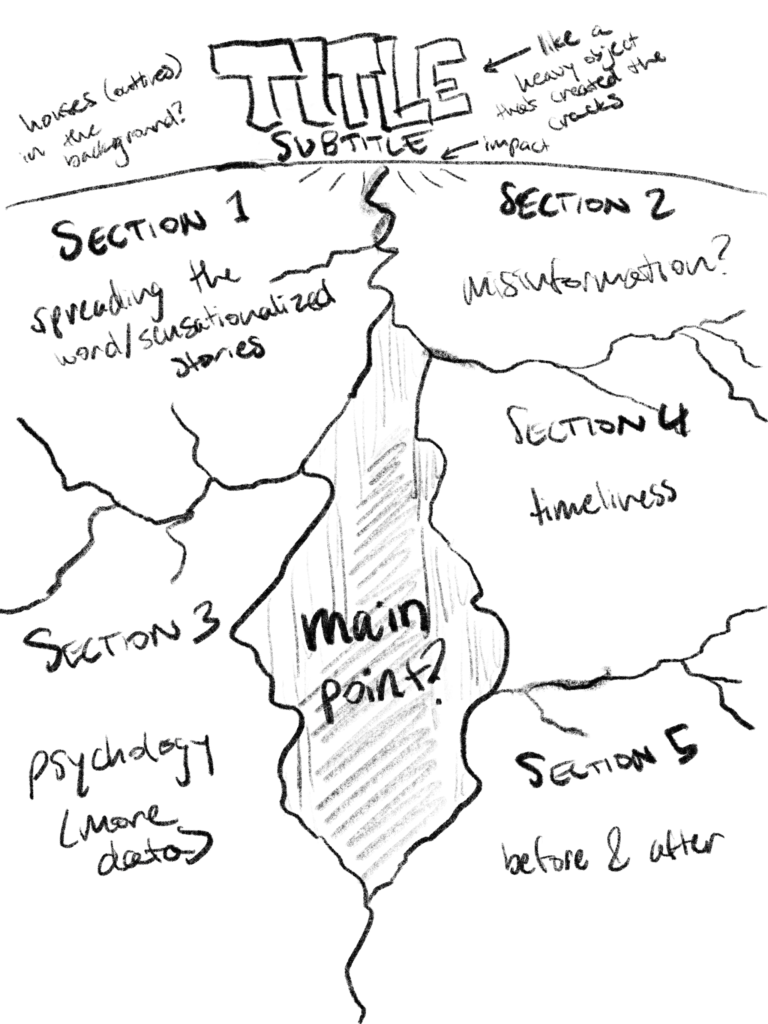
I have noticed that in media coverage, the saying “if it bleeds it leads” often turns out to be true, especially with disaster reporting. For this infographic, I wanted to research this idea and present my findings in a clear and concise format. I have always been interested in the psychology behind news coverage for those doing the reporting as well as the story’s audience.
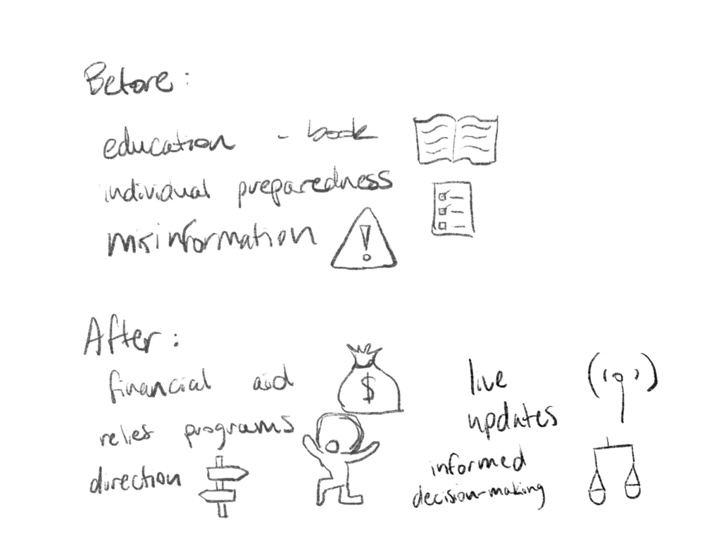
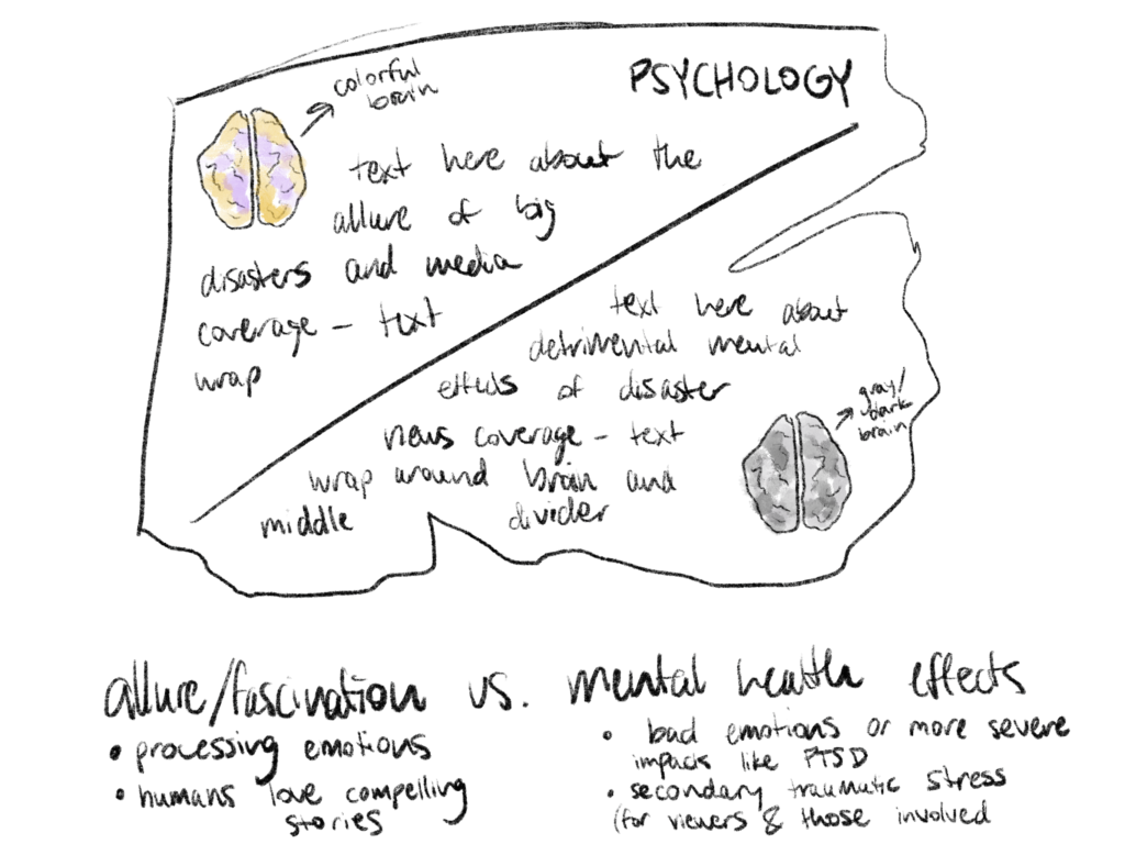
To make this information more palatable, I wanted to narrow my focus to only natural disaster coverage. I had an idea of how I wanted to present this information visually, so I began with some rough sketches. As I moved on to the actual research, I spent a long time tweaking my designs to better capture the messages I wanted to convey. I used Procreate to draw the earthquake cracks as well as some of the smaller section graphics, and I put the whole thing together in Adobe Illustrator.
I am especially proud of this infographic because it required more time and planning than any other I have done. I needed to do a lot of research from a variety of different sources and make many changes of varying sizes to the design and subject matter to have the finished product look exactly the way I wanted.
Reconstructing the Past
COCHRAN_finalRead About My Process
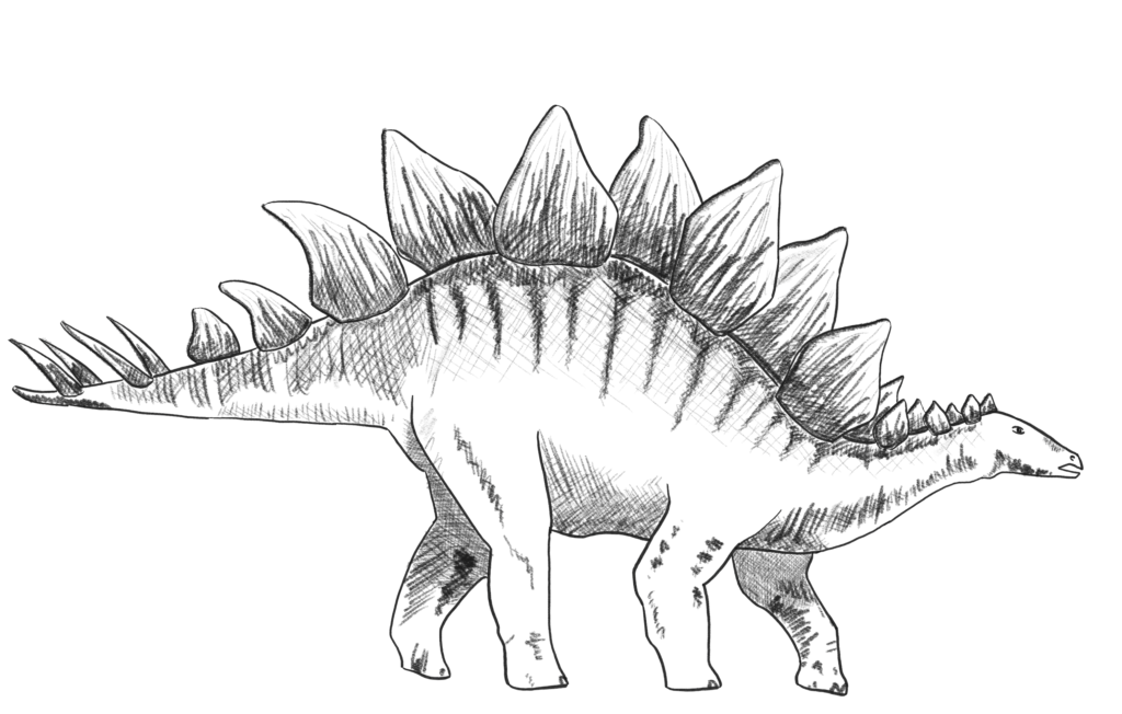
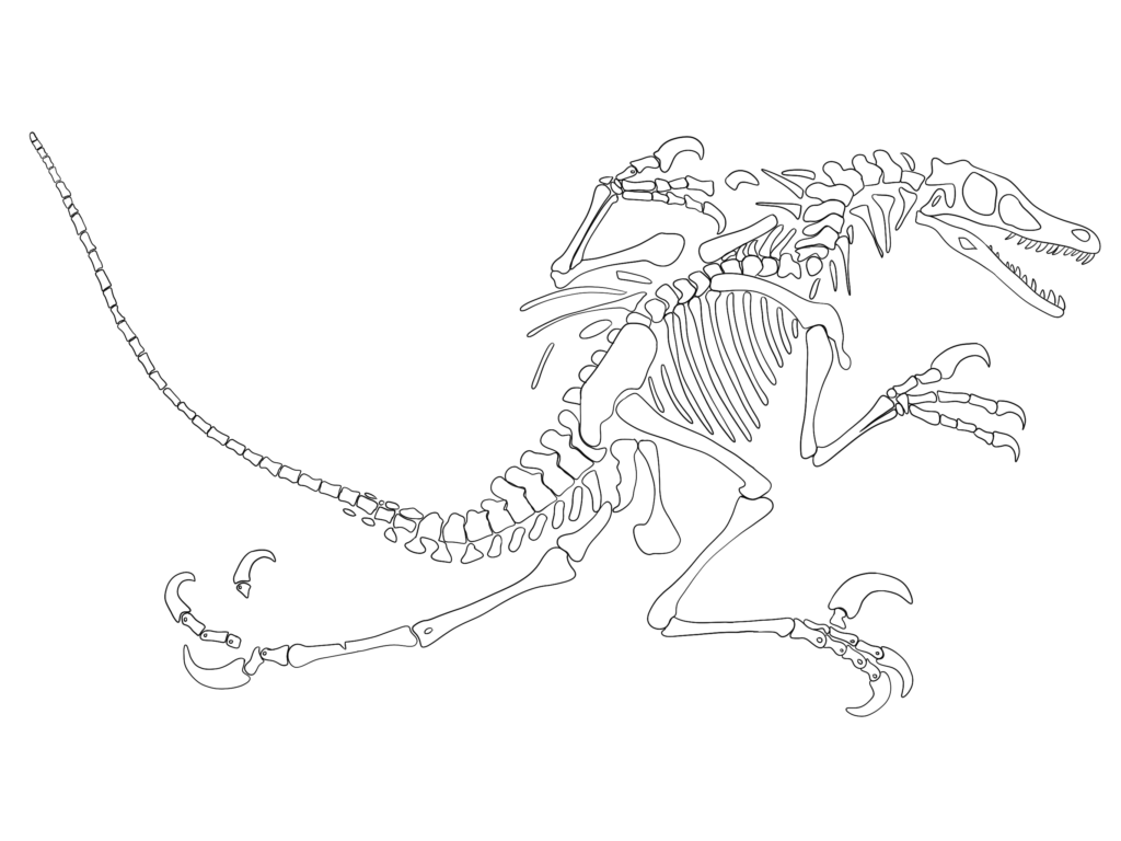
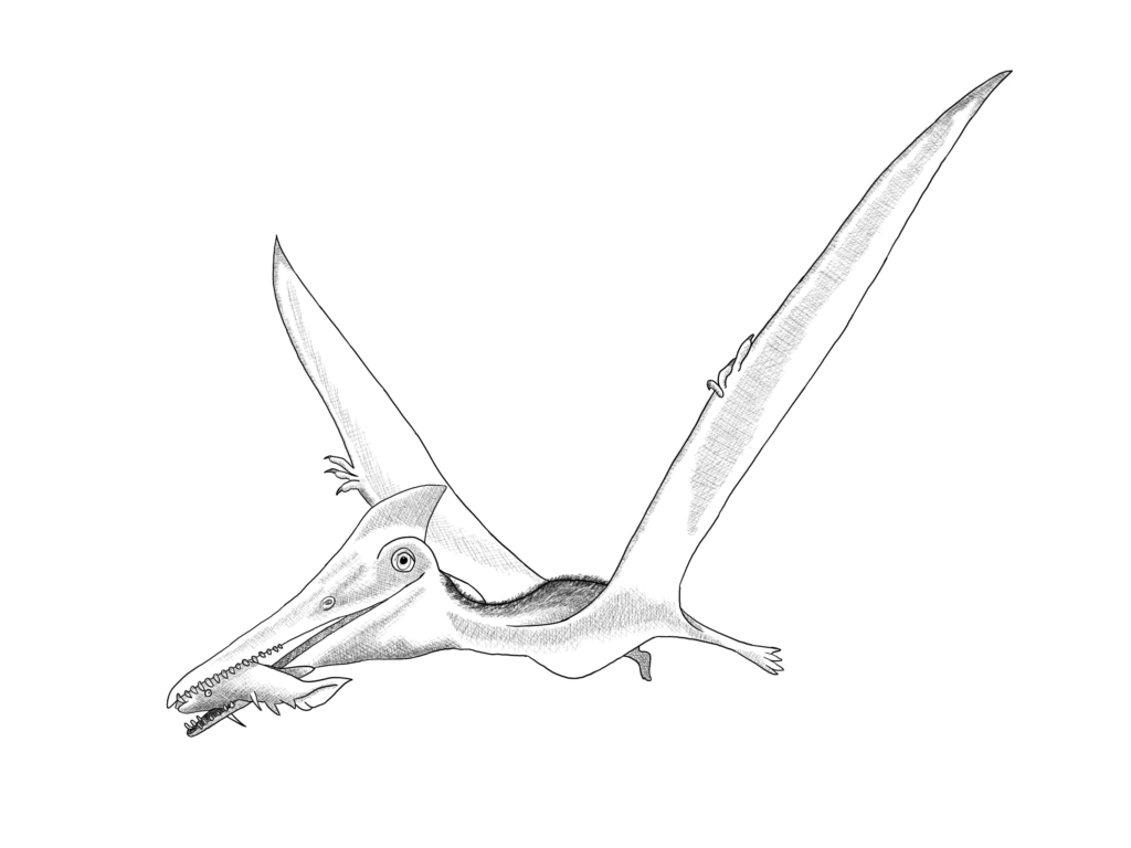
This infographic was meant to show off my illustration skills, so I hand-drew all of the visual elements in Procreate. I love dinosaurs and was excited for the chance to draw some, so I knew when I began brainstorming that my infographic would have something to do with them.
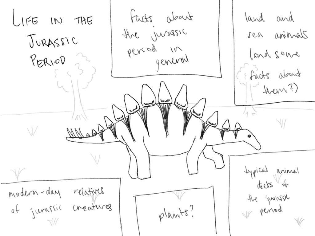
Originally, I wanted to put together a general overview of life in the Jurassic Period, but as I began researching and planning I realized a more niche subject would work better for this infographic. I had recently read an article about how new scientific discoveries are giving better insight into what some dinosaurs looked like, so I decided to narrow my focus to that subject.
I kept the design relatively simple and let the illustrations speak for themselves, but my biggest challenge was trying to include enough written information to make the infographic impactful and educational while not overcrowding the visual layout. I used a simple color scheme to help the drawings stand out, and a subtle background pattern of dinosaur bones to pull the whole design together.
I spent most of my time for this project working on the illustrations in Procreate, but each piece of the final product- from the typography to the spacing- was carefully arranged in Adobe Illustrator. I used a cross-hatching technique for the drawings.
The Gravity of Space Tourism
Cochran_Ellen_project4Read About My Process
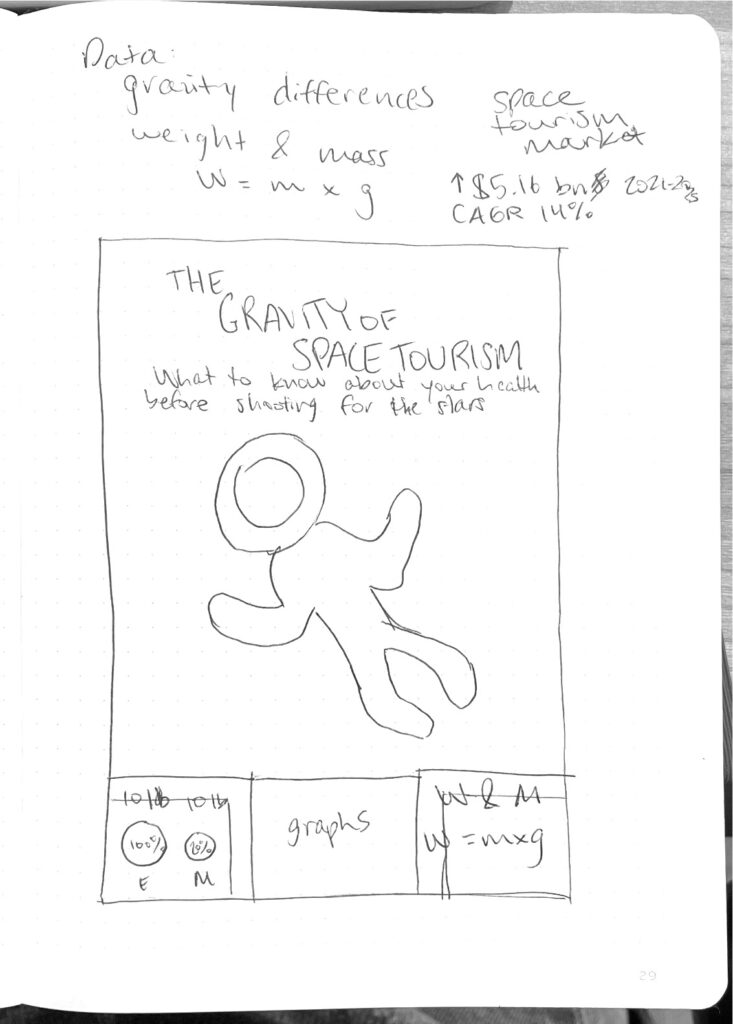
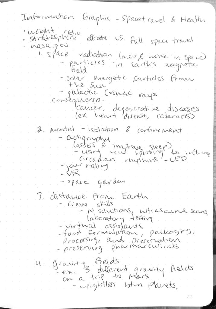
This is one of the first infographics I created, but it is still one of my favorites. I think my color scheme and graphic style do a very good job of conveying the type of information I wanted to highlight with this project. This infographic was also one of the first times I had to fully sketch out and research before a graphic design project, so I learned the importance of preparing properly. I still like to sketch out my ideas and iterations in my journal for any design project.
This infographic was a good opportunity for me to practice conveying a lot of information in a way that was organized and not overwhelming for the viewer. Though I included a lot of text, I was able to keep it manageable with visual hierarchy.
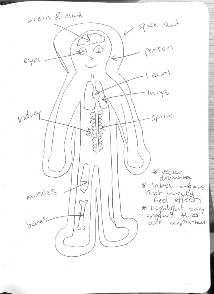
The astronaut graphic required some problem-solving because I wanted the design to be clean and simple while including many small, overlapping pieces. I ended up using contrasting colors and a drop-shadow effect to achieve this look. This infographic was made entirely in Adobe Illustrator.

Dune Magazine Spread
Cochran_Ellen_project3aCochran_Ellen_project3b
Cochran_Ellen_project3c
Read About My Process
For this project, I used InDesign to create a sample magazine spread. I used preexisting stories by Stephanie Zacharek, Anthony D’Alessandro and Justin Kroll, and Charlie Hall, as well as promotional and behind-the-scenes photos from the movie. All of the design and layout choices, however, were my own.
Linda’s Trivia Posters

Read About My Process
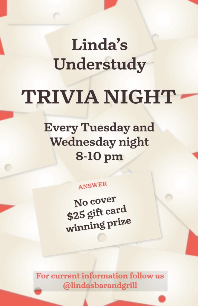
For this project, I made posters for the trivia nights hosted at Linda’s Bar and Grill on Tuesday and Wednesday evenings. My main inspiration for these posters was the old trivia tickets that the owner has kept over the years. When the parts of the restaurant were redesigned during the COVID-19 quarantine, many of the old tickets were used as wallpaper in the bathrooms, and the Linda’s website has a picture of stacks of them on the page about trivia. I wanted to maintain this same link with the posters.
I started my process by creating a default trivia ticket design in Illustrator. For my first poster, I used these tickets (placed as smart objects) to convey the important event information, and I angled the main ticket to send the viewer’s eye up to the ticket reading “Linda’s Understudy.” The lower tickets are angled to bring the viewer’s eye back down to the rest of the information.
Because I did not want a plain background behind the tickets, and I wanted to further indicate the fact that it is a trivia event, I found eight different images for trivia-related subjects. I then cut these images to have transparent backgrounds in photoshop and created a layer of these items in a repeating pattern across the page. On the sample trivia tickets that I got from Linda’s, the subject on the top is labelled in red ink. I wanted to mimic this by having “question” and “answer” notes at the top of the tickets, and I used coolors.co to find a red color that was compatible.
For my second poster, I maintained the trivia ticket element by using them as my background, but I wanted it to look as though they were dropped randomly, so I kept my red background underneath them so it could show through. I only had the red show through on the edges, though, because I knew it would make the words in the middle harder to read. I took the informational text out of specific trivia tickets and rested it over all of them to provide more distinction between the first poster, but I did have one ticket with the cover and winning information attached to a card. I increased the size of this specific ticket and blurred all of the background tickets slightly to make the top one stand out more.
Blue Sky Innovations Visitor Map
Read About My Process
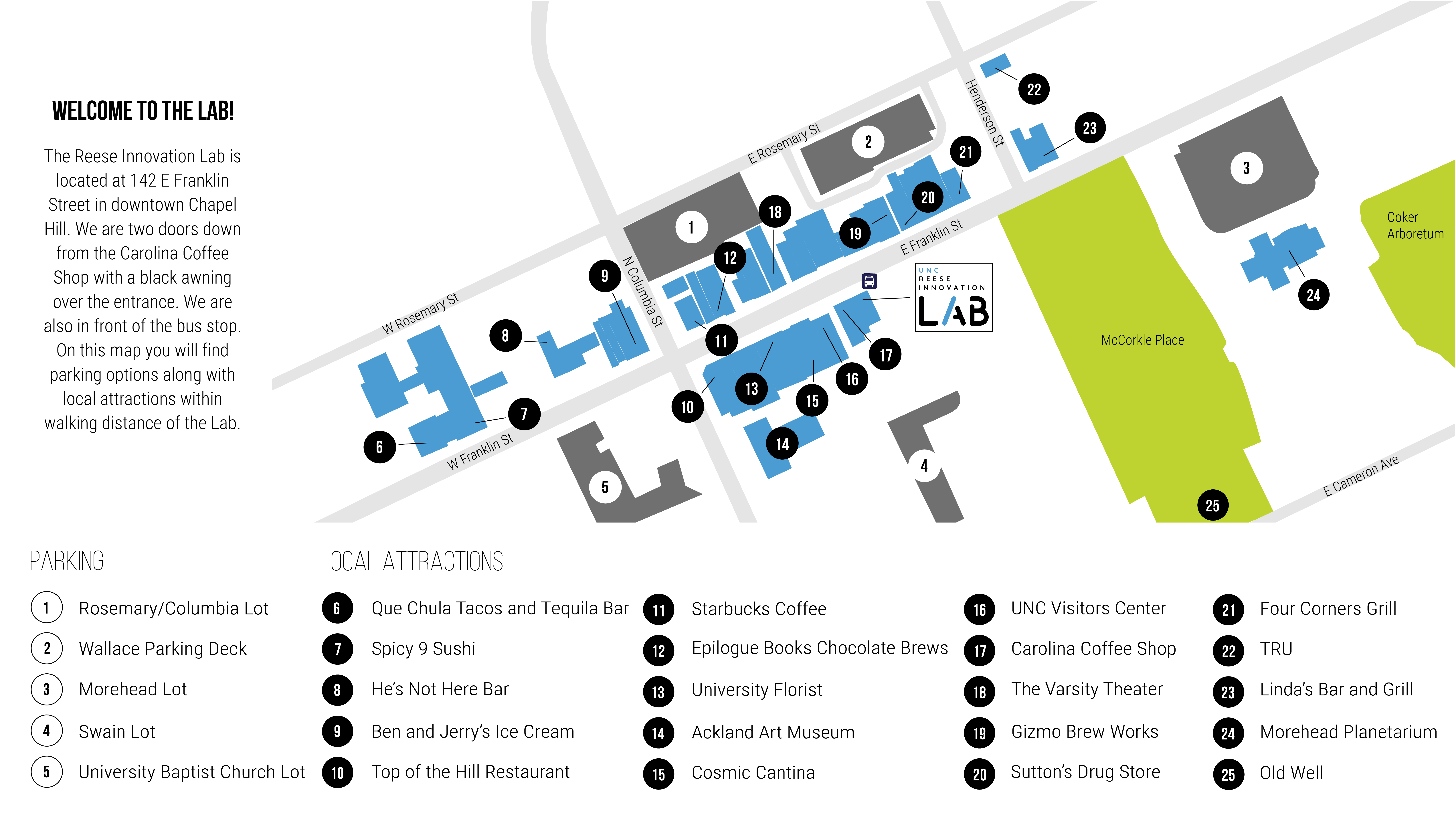
This is a map I created in Illustrator to include in emails to guests of the Lab and to have physical copies on hand for various uses. The design is meant to be small and portable, so I wanted it to be as informative as possible while also being clear and not overwhelming.